Project Overview
Sizzle is a website for a fictional recipe blog. It serves as the homepage and main entry point for users to discover recipes.
The primary goal was to take a set of provided assets (images, recipe names) and build a fully responsive, visually appealing, and well-structured webpage from scratch.
As a recipe blog website, I wanted to put a high emphasis on the food images. Often times it is hard to entice someones appetite simply just through words, so I opted for the image route.
My Role & Technologies Used
My Role
- Front-End Developer, UI Developer
Technologies
- HTML5: Used for semantic structure and content.
- CSS3: Used for all styling, layout, and responsiveness.
- JS: Used for filtering mainly
- Photoshop: Logo creation
Color Palette & Typography
For the visuals, I wanted to create a clean, modern, and elegant look. The site needed to look "tasty" and professional, making the recipes feel high quality, while also being readable and simple for a user who is actively trying to cook.
Color Palette
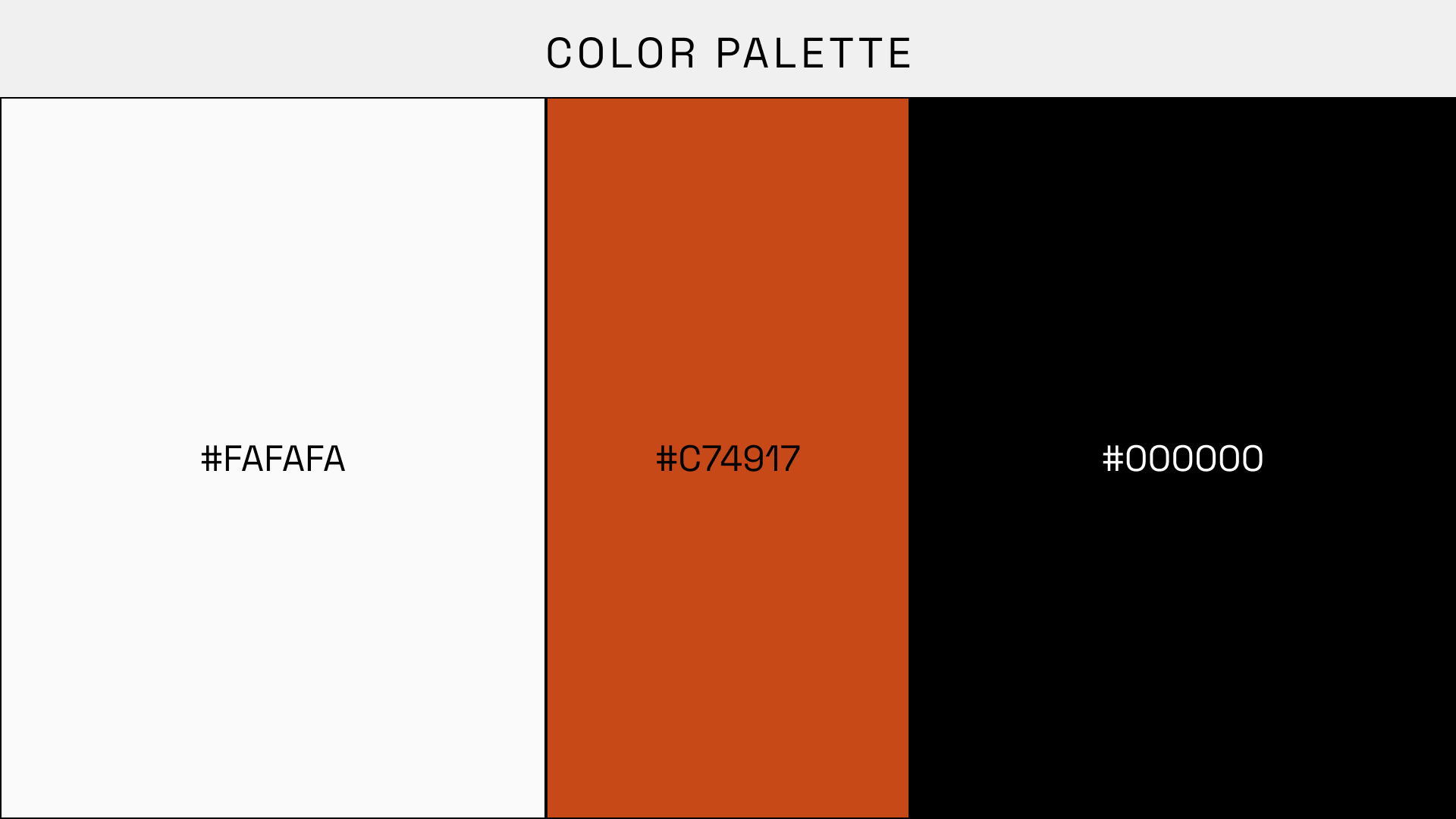
The color palette is built on a high-contrast foundation. I used black, white, and a soft off-white to create a clean, structured layout.
A single, rusty orange serves as the only accent color. It's used exclusively for interactive elements like link hovers, buttons, and focus glows. This shows the user to associate this bright color with action, making the site intuitive to navigate.
Typography
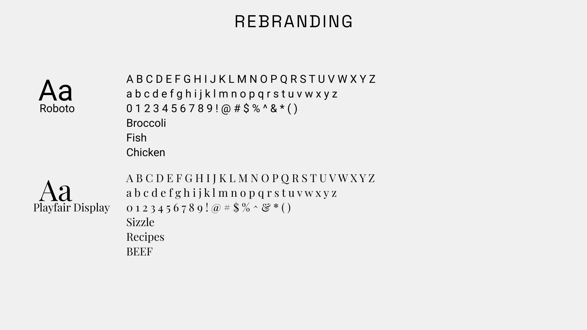
- Playfair Display: An elegant, high contrast serif font is used for all headings and links. This gives the site a premium, "cookbook" feel and creates a strong visual hierarchy.
- Roboto: A clean, modern sans serif font is used for all body text, like recipe descriptions and instructions. This ensures that all the important content is highly legible and easy to scan.


Conclusion
I learned how to effectively use media queries to manage multiple layout breakpoints, fine-tuning padding, font-sizes, and flex properties for each screen.
I also gained experience in creating subtle micro-interactions with CSS transitions, which add a layer of polish to the user experience.
Future Improvements:
The next step for this project is to implement JavaScript to power the search bar. This would add dynamic functionality, allowing users to search for exactly what they want as soon as they land on the page, rather than just being a static element.