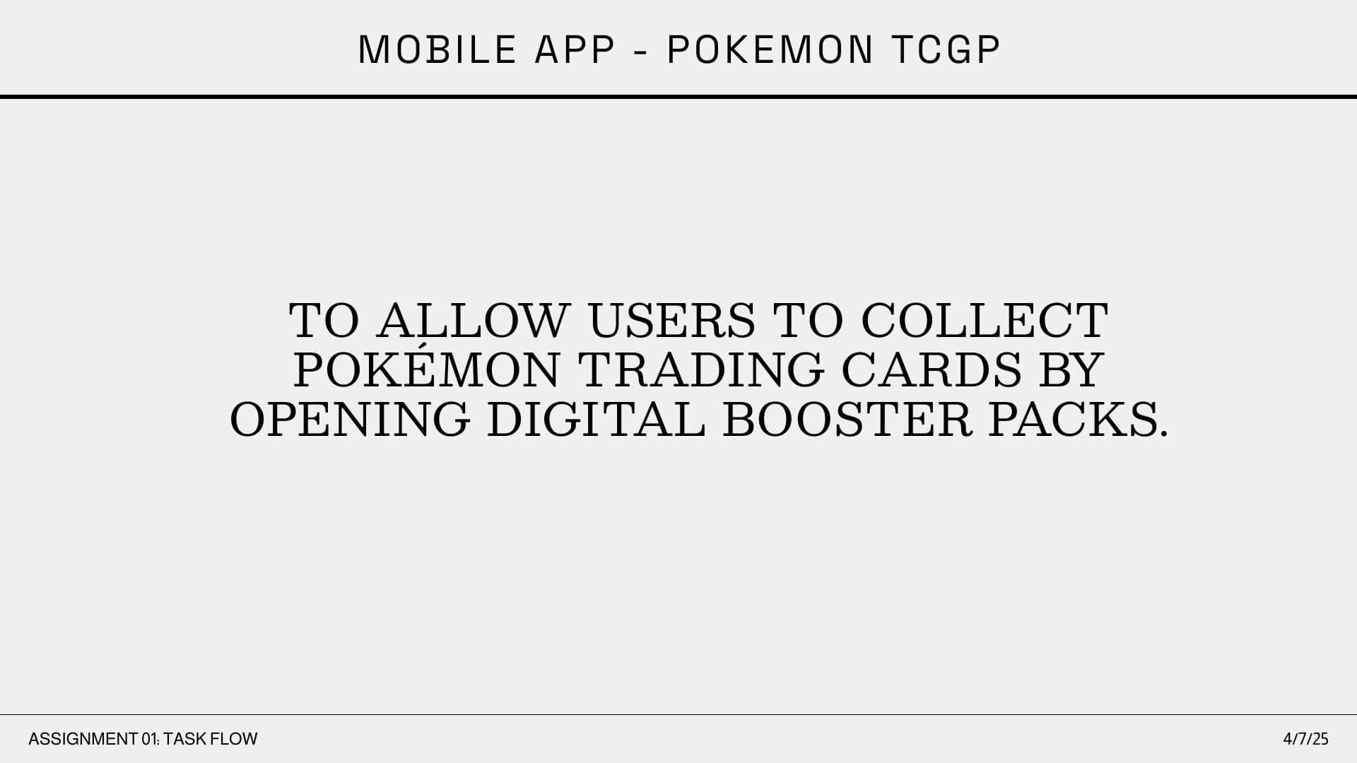
The Problem & Project Goals
The original pack opening experience in Pokémon TCG Pocket suffers from significant friction that turns a moment of excitement into a chore.
The core issues are twofold: first, the reward loop is slowed down by, unnecessary animations, making the process feel tedious.
Second, a disorienting user flow, which defaults players to the newest pack instead of a central hub, forces them to navigate backward just to access other features.
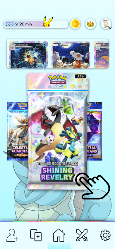
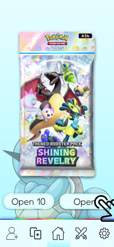
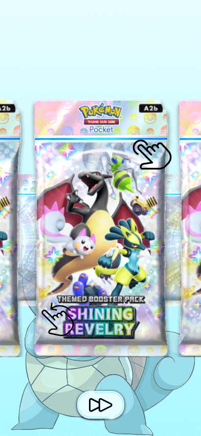
Lastly, I wanted to put more of a focus on the actual packs themselves. Surprisingly, the packs in the original design are relatively small and don't seem like much of a center point. I am to change that.
These are my goals.
- 1: To feel the same excitement as opening a physical pack.
- 2: Increase player delight and create a "shareable" moment.
- 3: Redesign the flow to be faster, more tactile, and more rewarding.
Research & Discovery
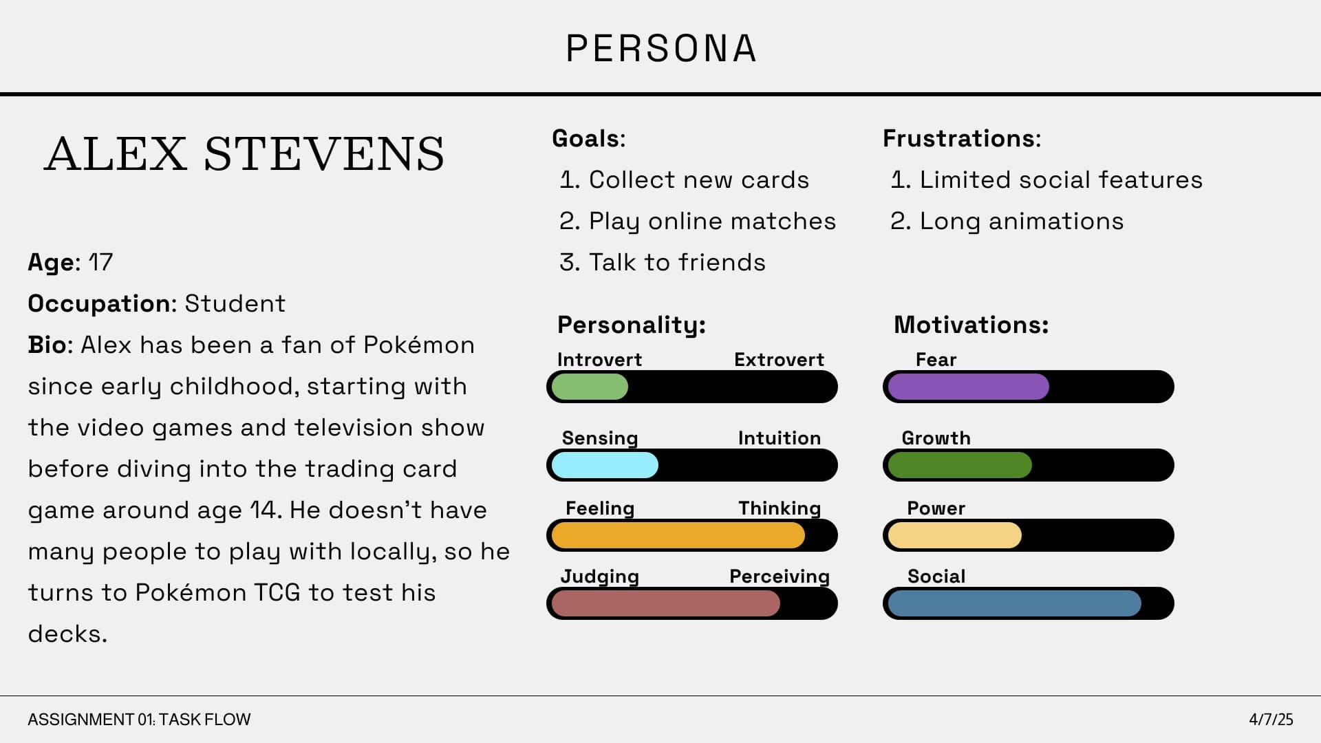
To investigate my initial problem statement and understand the user, my research focused on identifying the specific pain points and motivations of a core player. This was put together into a user persona based on common player archetypes found in TCG communities.
I created the persona of "Alex Stevens" to represent a primary player persona: the 17-year-old student who is engaged with the game's strategy. This persona is not a casual collector; he is a "Deck Builder" who wants to "test his decks" and "play online matches".
Some key insights I was able to gain:
- 1: Alex's primary frustration is "Long animations," which directly confirms that the slow pack-opening sequence is a significant pain point for engaged users.
- 2: The user's number one goal, "Collect new cards," is directly hindered by his biggest frustration, creating a critical point of friction that turns the reward loop into a chore.
Competitor Analysis
- Marvel Snap: At one end, Marvel Snap excels at efficiency. Its reward track is fast, tactile, and visually clear, allowing players to claim rewards and get back to the game in seconds.
- Hearthstone: At the other end, Hearthstone excels at delight. Its pack opening is a classic example of building anticipation, with light bursts and special sounds for rare cards. However, it can also feel slow when opening many packs at once.
Process & Interaction Flow
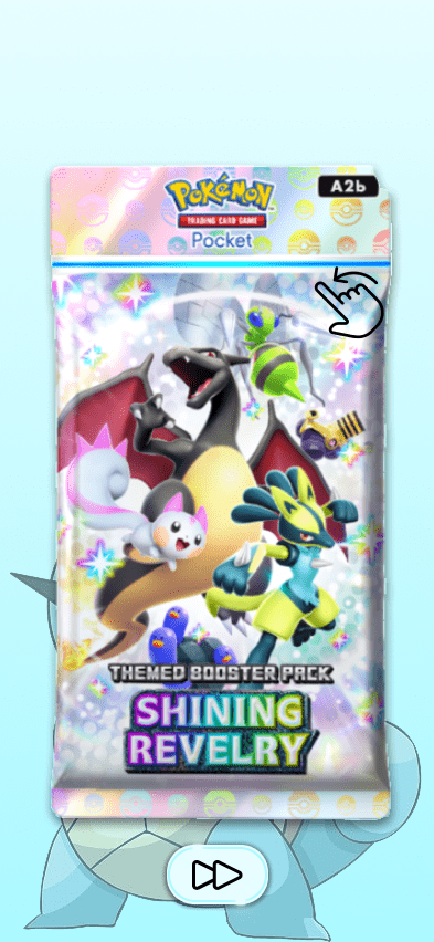
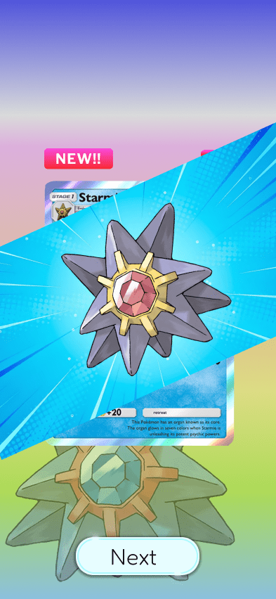
Originally, the skip button didn't bring the user to the end of the pack. Instead it skipped the current animation or screen that the user was on. Being a skip button I found this pretty counter intuitive, so I made it skip to the end of the pack opening.
I also streamlined the pack opening experience by giving you all the current pack options as soon as the user loads into the app.
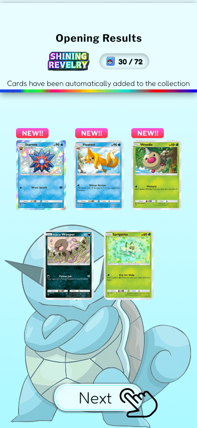
Lastly, I removed the animation of the cards being added to the user's collection as that felt like another time waster. Instead I let the user know the cards were automatically added to their collection at the end of the pack opening.
Visual Design & UI
For the visuals, I wanted to go for a clean, modern look. I aimed for a design that felt a bit more mature and digital first, but still had that classic Pokémon spark.
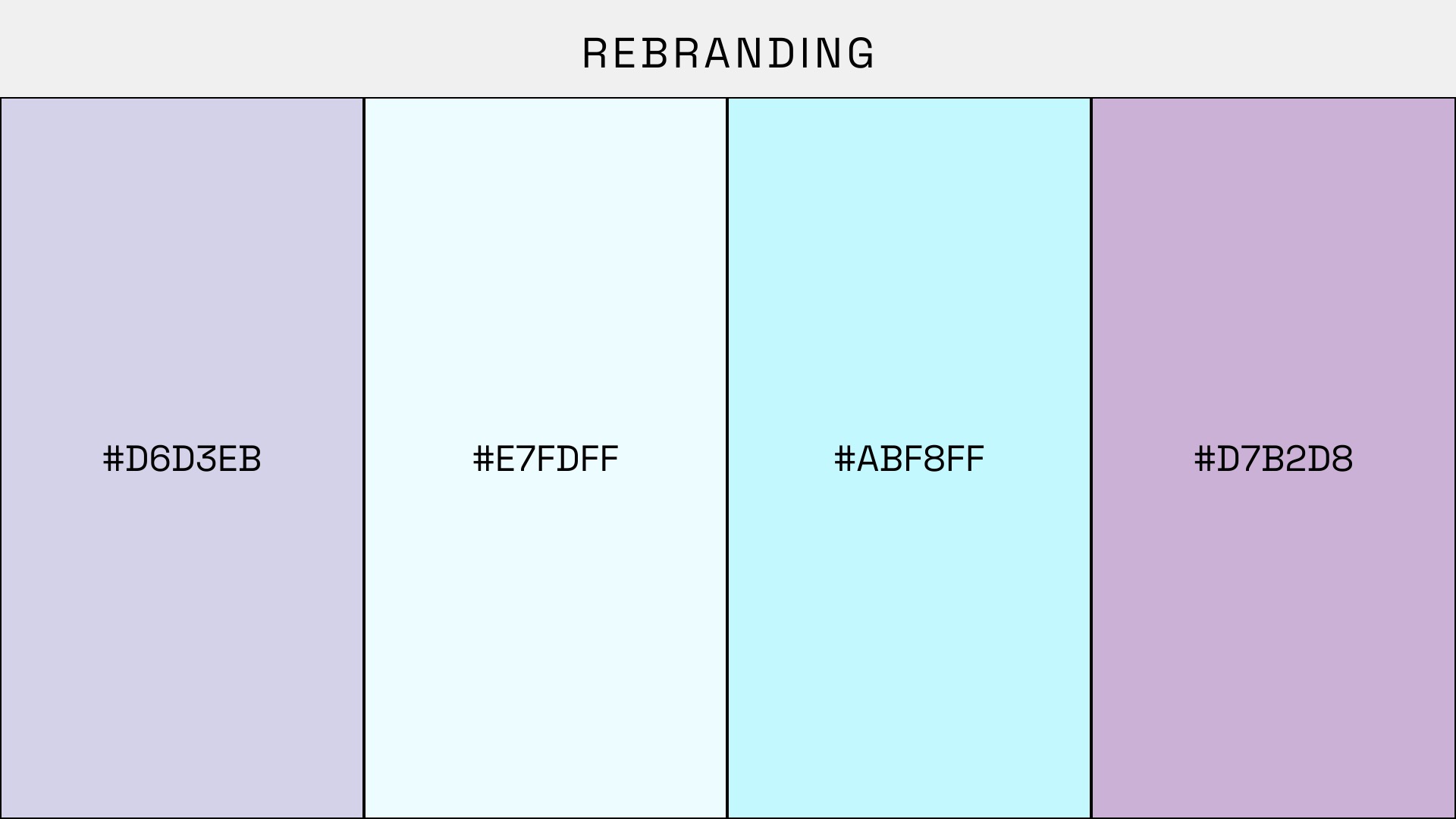
Color Palette
- Clean Backgrounds: For the background, I went with that light, airy blue. It just makes the colorful packs and cards really pop, so they're the main focus.
- Energetic Accents: That bright cyan is my main "pop" color. I used it mainly for important stuff, like showing the big animation when a pack opens. It's how I guide the users eye to look there.
- Celebretory Tones: That magenta is my secondary accent. I just sprinkled it in to highlight rewards and add a bit of personality, but I was careful not to overdo it.
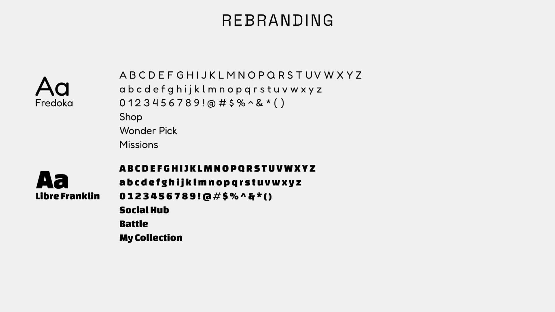
Typography
- Libre Franklin: This strong, geometric sans serif serves as the header font for all core functional elements. I used it for all primary navigation, like "Battle," "Social Hub," and "My Collection". Its legibility is perfect for our persona, Alex, allowing him to navigate efficiently to key areas like "Battle" screen without hesitation.
- Fredoka: To complement Libre Franklin, I Fredoka to add a touch of friendliness that fits the Pokémon brand. It's used for secondary, informational text like "Shop" and "Missions". This pairing adds welcome personality without cluttering the UI or competing with the main interactive elements.
